

In brief
- Deep red is establishing itself as the theatrical colour of the season, enhanced by combinations of velvet, dark wood and brass.
- A delicate alternative, dusky pink blends pink and beige to bring a cosy and soothing atmosphere to relaxation spaces.
- Celadon green succeeds sage green, pairing with Cloud Dancer, the Pantone 2026 colour of the year.
- Straw yellow warms up dark interiors thanks to elegant contrasts blending cane, rattan and black metal.
At the end of 2026, interior design is definitively breaking free from minimalist rigour to embrace a vibrant, joyful palette full of character. Contemporary lifestyle now invites us to dare to use colour, no longer in timid touches, but through genuine architectural statements. To breathe this new energy into our interiors, four signature shades are emerging as the season’s essentials to transform spaces with elegance and sophistication.
The theatrical boldness of deep red
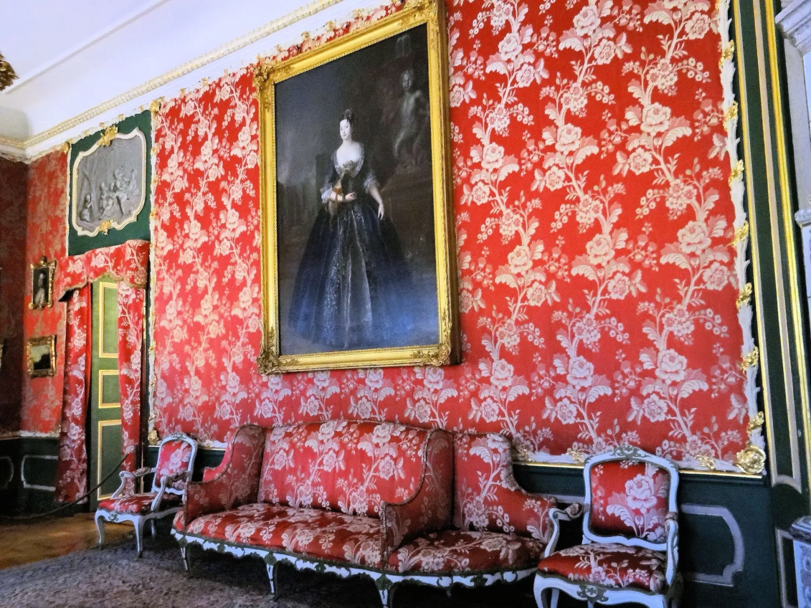
An intense and passionate colour par excellence, red invites itself into the most exclusive interior architecture projects to create a spectacular decor. Whether chosen in a deep shade like burgundy or a vibrant one like carmine, it immediately evokes the cosy atmosphere of historic theatres and Parisian interiors with a strong character. This shade does not seek discretion; it structures the space with rare confidence.
To integrate it brilliantly, designers recommend adopting it in the living room to shape an enveloping atmosphere during autumn evenings, or on an accent wall in the dining room to capture guests’ attention. To enhance its power, it is willingly paired with deep black, while pure white creates a striking graphic contrast. As for finishes, the marriage of red with velvet and brass brings incomparable depth and immediate sophistication to the space.
The enveloping softness of dusky pink
In contrast to the exuberance of red, dusky pink is establishing itself as the new neutral of refined interiors. A subtle balance between the softness of pink and the neutrality of beige, this shade appeals with its very soft, powdery nuances. It breathes an intimate and protective atmosphere, ideal for counterbalancing the hustle and bustle of daily life without ever sliding into a childish spirit.
The intimate softness of dusky pink
It can be adopted without hesitation in a master suite to promote serenity and rest, or in a boudoir to soften the lines of the furniture. While a total look is entirely possible on matt walls, dusky pink can also be introduced delicately through carefully selected textile pieces, such as heavy linen curtains, soft cushions or a textured wool rug. To preserve its harmony, overly bright colours should be strictly avoided, preferring to pair it with tones of beige, light grey or soft green that highlight its infinite delicacy.
The mineral serenity of celadon green
Celadon green, the fresh asset of the season
This year, celadon green dethrones sage green to become the ultimate reference for zen and refined atmospheres. Born from a subtle blend of green and grey, it takes its name and prestige from traditional Asian ceramics. Highly luminous, celadon has the unique ability to visually expand space while diffusing an aura of freshness and serenity.
This shade naturally finds its place in every room of the house. In the kitchen, it creates a warm atmosphere perfect for family moments, while in the bathroom, it recreates the ambience of a high-end spa. For a perfect match, celadon pairs with the off-white Cloud Dancer, designated colour of the year by Pantone in 2026. For a more contemporary contrast, it can be paired with touches of black or Mediterranean-inspired terracotta, all warmed by raw materials such as polished concrete, natural stone or honey-toned wood.
The luminous glow of straw yellow
Soft, airy and delicately golden, straw yellow is a key ally for spaces in search of light. Evoking the softness of late summer days and sun-dried straw, this colour has the immense advantage of warming up dark rooms without ever overwhelming the eye or saturating the space. It offers an elegant and cosy alternative to brighter or saffron yellows.
Straw yellow to illuminate and warm up spaces
Straw yellow works wonders in a north-facing living room, where natural light is often cold, as well as in cramped entrance halls where it visually pushes back the walls. For a harmonious integration, it pairs beautifully with lavender blue for a bohemian-chic spirit, or with earthy tones like ochre and dark brown to accentuate its warmth. As for furniture, we opt for light oak, cane and varnished rattan, punctuated by subtle black metal lines to bring a highly balanced industrial-chic touch.