

In brief
- Location: Living spaces and contemporary residential interiors.
- Key Figures: 4 major shades at the heart of the 2026 palette.
- Key Players: The Pantone Color Institute and interior designers.
- What’s New: The return of theatrical boldness paired with powdery shades.
In brief
- The 4 key shades of 2026 reinvent decor, balancing theatrical boldness and serenity.
- Celadon green stands out alongside Cloud Dancer white, the Pantone colour for 2026.
- Intense red, powdery dusty pink, and straw yellow complete this character-rich palette.
The 2026 season marks the confident return of colour in interior design through a rich and nuanced palette. To refresh living spaces with elegance, four key shades define the trends for the year: theatrical red, powdery dusty pink, celadon green, and straw yellow. The 2026 colour trends favour characterful palettes capable of structuring spaces while creating muted or light-filled atmospheres.
Theatrical red to structure volumes
An intense hue par excellence, red reintroduces a dramatic dimension into contemporary homes. Evoking muted interiors and opera settings, this shade expresses itself as much in deep variations as in vibrant tones.
Theatrical red, the star of social spaces
In spatial layout, this shade naturally finds its place in the living room to create an enveloping atmosphere, or on an accent wall in the dining room to form a focal point. To balance this visual power, recommended chromatic pairings rely on black to enhance depth, white to offer a graphic contrast, and golden touches to underline the overall sophistication. Pairings of dark wood and velvet reinforce the singular presence of this bold colour.
Dusty pink for powdery softness
A subtle balance between the delicacy of pink and the neutrality of beige, dusty pink has established itself as a pillar of contemporary interiors. Its powdery shades infuse an enveloping, timeless atmosphere, conducive to rest.
Powdery dusty pink, softness for bedrooms
Particularly suited to bedrooms to promote tranquility or to living areas to soften architectural lines, dusty pink can be applied as a total look or through textile accents. Curtains, cushions, and rugs are ideal mediums to subtly diffuse its presence. To preserve visual coherence, overly bright shades that might disrupt this harmony should be avoided. Pairings with beige, light grey, or soft green enhance the delicacy of this shade, beautifully complemented by light wood, linen, and natural fibres.
Celadon green for a zen atmosphere
Celadon green, versatility and natural elegance
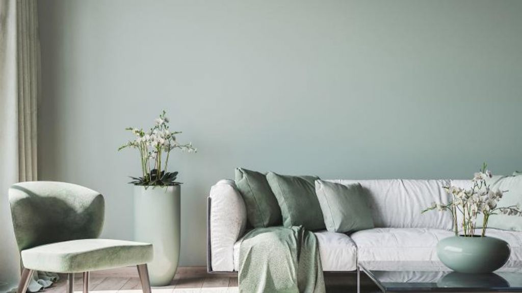
A subtle blend of green and grey, celadon succeeds sage green in this year’s interior design choices. Inspired by traditional Asian ceramics, this shade brings soothing clarity and a zen dimension to interior spaces.
This versatile shade fits seamlessly into every room of the house. In the living room as in the bedroom, it helps to visually expand perspectives. In the kitchen, it creates a warm setting suited to family gatherings, while in the bathroom, it unfolds a mineral aura. In terms of chromatic combinations, celadon pairs remarkably well with Cloud Dancer, an off-white shade designated as the Pantone 2026 colour, as well as with black for a contemporary contrast or terracotta for Mediterranean accents. Raw materials such as concrete and stone underline the sleek character of this sophisticated green.
Straw yellow to illuminate spaces
Reminiscent of soft summer light, straw yellow infuses natural warmth into the home without ever overwhelming the eye. Slightly golden, this tone provides an ideal way to diffuse brightness into the heart of darker rooms.
Straw yellow, light and warmth for north-facing rooms
In a north-facing living room, this shade instantly warms the overall ambiance. Used in a small hallway, it visually expands spatial boundaries by bringing a sense of openness. Visual harmony is achieved by pairing straw yellow with lavender blue for a boho-chic feel, or with earthy tones such as ochre and brown. Light wood and cane furniture naturally align with this sunny colour, elevated by a few touches of black metal.
2026 colour palette guide
- Intense red: reserved for the living room or dining room · associated materials: velvet, brass, dark woods.
- Powdery dusty pink: ideal for the bedroom and living area · associated materials: linen, natural fibres, light wood.
- Celadon green: suitable for all rooms · pairings: Cloud Dancer white (Pantone 2026), raw concrete, stone.
- Straw yellow: perfect for north-facing rooms and hallways · associated materials: rattan, cane, touches of black metal.