
In brief
- Intense red is a must for structuring theatrical and enveloping spaces.
- Dusky pink and celadon green offer soothing and balanced alternatives.
- Straw yellow brings a subtle and warm brightness to north-facing rooms.
This season’s design launch celebrates the trend colours of 2026 through a warm and assertive colour chart to reinvent interior design. Gone is timid neutrality; now is the time for self-expression through strong chromatic choices that redefine contemporary elegance.
- Key shades: Theatrical red, dusky pink, celadon green, straw yellow
- Pantone complement: Cloud Dancer (off-white)
- Preferred materials: Velvet, brass, dark wood, rattan, raw concrete
The boldness of red for a theatrical decor
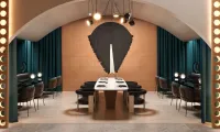
An intense colour par excellence, red is once again making its mark in the most elegant interiors, bringing undeniable passion and theatricality. Whether deep like a burgundy or vibrant, it instantly recalls the cosy atmospheres of historic theatres and Parisian decors with character. In the living room, it creates an enveloping atmosphere conducive to intimate conversations, while on an accent wall in the dining room, it catches every eye and warms up dinner parties.
Theatrical red for a bold interior
To enhance this bold shade, pairing it with black reinforces its dramatic intensity, while touches of gold or brass elevate its refinement. As for furniture, the nobility of dark wood and the textured softness of velvet provide the necessary depth to balance the visual power of this spectacular hue.
The softness of dusky pink to soothe spaces
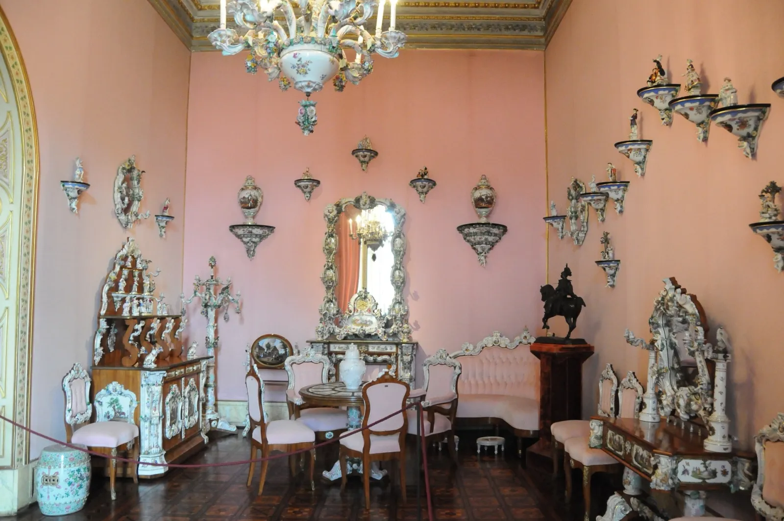
In contrast to the vibrancy of red, dusky pink positions itself as a true haven of chromatic peace. Born from a subtle and tender blend of pink and beige, it charms with its powdery shades that distil an atmosphere of absolute comfort. It is easily adopted in a bedroom to invite peace of mind, or in a living room to soften the lines of contemporary furniture. It works just as well as a total look or through selected accessories such as flowing curtains, textured cushions or a thick rug.
The poetic softness of dusky pink
Dusky pink for a delicate touch
To preserve all its delicacy, this shade must be paired with care. Too bright colours that would disrupt its natural harmony should be avoided, and neutral companions like beige, light grey or a soft green should be preferred. In terms of furniture, dusky pink pairs wonderfully with natural materials: light wood, washed linen and woven fibres highlight its warm and timeless spirit.
Celadon green stands out among the 2026 trend colours
Celadon green for a soothing atmosphere
Celadon green for a soothing ambiance
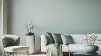
An heir to the sage green that dominated decor for so long, celadon green is now emerging as the ultimate touch of sophistication this year. This refined blend of green and grey, evoking the delicacy of traditional Asian ceramics, is the ideal ally for interiors seeking a serene, uncluttered and highly elegant aesthetic. Its great asset lies in its versatility: it visually expands a bedroom space, brings an intimate and warm dimension to the kitchen, and transforms the bathroom into a true spa with a zen aura.
To compose a memorable decor, celadon is paired with safe bets. The alliance with Cloud Dancer off-white, chosen as the Pantone colour of 2026, creates a luminous contrast of great modernity, while terracotta brings a Mediterranean-inspired warmth. Furniture in waxed concrete, raw stone or light rattan completes this score focused on naturalness and texture.
Straw yellow to diffuse a warm light
Light, soft and subtly golden, straw yellow is the very embodiment of summer light invited indoors. This warm shade evokes sunny landscapes and instantly warms the atmosphere without ever offending the eye. It is the master asset for dark or narrow spaces, such as a north-facing living room or a small hallway, whose walls it visually pushes back while creating a particularly welcoming feel.
Straw yellow to illuminate the space with elegance
Straw yellow to illuminate with elegance
In terms of combinations, straw yellow offers multiple possibilities. Pairing it with lavender blue creates a bohemian and poetic atmosphere, while matches with earthy colours like ochre and brown lend a cosy and enveloping spirit. For furniture, light wood and cane work are favoured, while introducing touches of black metal to provide a graphic counterpoint in a chic industrial style.